The most effective trade show brochures use a clear headline that states the core benefit, high-resolution photography at 300 DPI, CMYK color mode, and a single, prominent call to action. The most common formats for NYC trade shows are tri-fold on 100 lb. gloss text and saddle-stitched booklets (8–16 pages) for product catalogs. Plan to order 250–500 copies for a 2-day show and submit files at least 7–10 business days before your event. Unique Print NY at 242 West 36th Street, New York, NY 10018 prints trade show brochures for NYC exhibitors with a complimentary prepress review on every order. Call (212) 420-9198 Monday–Friday 9AM–5PM.
Most trade show brochures fail before they’re even read. They’re picked up at a booth, glanced at for three seconds, and slipped into a bag to be thrown away at the hotel. The design is generic. The headline is the company name. The copy is dense, jargon-heavy, and self-referential. There’s no clear reason for the reader to keep reading — and so they don’t.
A brochure that converts is a different object entirely. It interrupts the routine of trade show fatigue. It communicates a clear, specific benefit in the first second. It gives the reader a reason to engage, a reason to keep it, and a reason to follow up. And when it’s printed on premium stock with professional color reproduction, it communicates brand quality through touch before a word is read.
At Unique Print NY, we print trade show brochures for exhibitors across New York City — from first-time startups at the Javits Center to established brands at industry conferences across Midtown. This guide covers everything: which format to choose, how to design for conversion, what paper to use, how to prepare your files, and how to order with enough lead time to arrive fully prepared.
Choosing the Right Brochure Format
The format of your brochure — how it folds, how many panels it has, and how thick it is — should be determined by the complexity of your offering and how your audience will use it. Here are the four primary formats used by NYC trade show exhibitors:
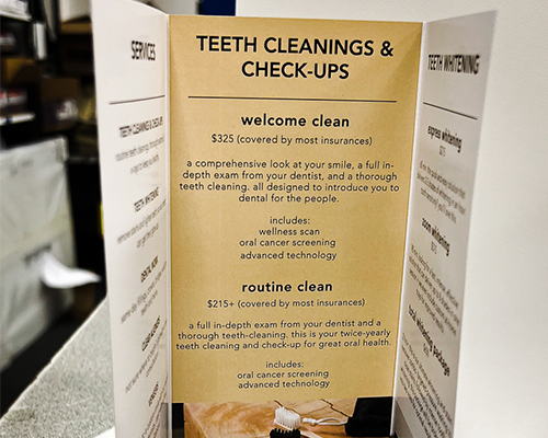
A single sheet folded into three equal panels, creating six surfaces (three on each side). The tri-fold is the workhorse of trade show collateral — universally recognized, easy to distribute, compact enough to fit in a pocket or bag, and cost-effective to produce in high quantities.
When to use it: A focused product or service offering that can be communicated across six panels. Ideal for service businesses, agencies, and companies with a clear, single-message value proposition. The front panel is your headline and hook; the inside three panels tell the story; the back panel provides contact information and a CTA.
Standard size: 8.5″ × 11″ flat (becomes 3.67″ × 8.5″ folded) · or 8.5″ × 14″ flat for more panel space
Recommended stock: 100 lb. gloss text (most popular) · 100 lb. matte text (for sophisticated editorial feel)
Best for: Focused single-service messaging
Typical quantity: 250–500 per show
Clean & Visual
A single sheet folded once down the center, creating four panels — a front cover, two inside pages, and a back cover. The bi-fold offers significantly more visual space per panel than a tri-fold, making it ideal for brands where photography and visual impact are primary communication tools.
When to use it: Brands with strong visual identities — fashion, real estate, architecture, food and hospitality, product companies — where imagery should dominate and text is secondary. The large inside spread (when fully opened) creates an impressive, magazine-like visual moment.
Standard size: 8.5″ × 11″ flat (becomes 5.5″ × 8.5″ folded) · 11″ × 17″ flat for a larger presentation
Recommended stock: 100 lb. gloss text · Premium option: 100 lb. silk text
Typical quantity: 250–500 per show
Premium Leave-Behind
A multi-page booklet (8–32 pages) printed and bound with staples through the spine. The saddle-stitched booklet is the most substantial trade show leave-behind available — it communicates depth, investment, and seriousness that no single-sheet brochure can match.
When to use it: Product catalogs with multiple SKUs or product lines. Capabilities presentations for B2B service businesses. Industry reports or data-driven content pieces. Companies whose offering requires more than six panels to present properly. Any situation where you want prospects to spend more time with your brand materials after the show.
Standard sizes: 8.5″ × 11″ · 5.5″ × 8.5″ (digest format) · 8.5″ × 5.5″ landscape
Recommended stock: 80–100 lb. gloss text interior · 100 lb. cover stock with soft-touch laminate
Best for: Catalogs · Capabilities · B2B selling tools
Page count: 8, 12, 16, 20, 24, or 32 pages
High Impact · Specialty
Z-folds (accordion-style back-and-forth panels) and gate-folds (two outer panels that open like doors to reveal a dramatic inner spread) are specialty formats that create a memorable physical experience when a prospect opens them. They stand out in a stack of standard tri-folds and create a moment of discovery that reinforces brand differentiation.
When to use them: Product launches, luxury brand presentations, or any situation where the act of opening the brochure should feel like an event. Gate-folds in particular are used by high-end fashion brands, luxury real estate developers, and premium hospitality companies. They cost more than standard folds and require careful design consideration — but the impression they leave is proportionally stronger.
Ask Unique Print NY about specialty fold availability
Format Comparison: Which Is Right for Your Trade Show?
| Format | Best Audience Size | Content Complexity | Cost per Unit | Impression Level |
|---|---|---|---|---|
| Tri-Fold | High volume | Simple — single message | Lowest | Professional |
| Bi-Fold | Medium volume | Visual-first messaging | Low | Strong |
| Saddle-Stitched Booklet | Targeted prospects | Complex — multi-product or full capabilities | Medium | Premium |
| Gate-Fold / Z-Fold | Select VIP prospects | Brand experience focused | Higher | Luxury |
Many experienced NYC exhibitors print two brochure formats for the same show: a high-volume tri-fold for general distribution (500–1,000 copies) and a premium saddle-stitched booklet for serious prospects and follow-up meetings (100–200 copies). The tri-fold captures broad awareness; the booklet closes the serious conversations.
How to Design a Trade Show Brochure That Converts
Design is where most trade show brochures succeed or fail. The following principles are drawn directly from what works on NYC show floors — not general design theory, but the specific conditions of a trade show environment where attention is scarce, competition is intense, and prospects are making instant decisions about what to keep and what to discard.
Principle 1: Lead With the Benefit, Not the Brand
Highest Impact Design Decision
Most brochure covers feature a company name and logo — and nothing else. This is a wasted opportunity. A prospect who doesn’t already know your brand has no reason to open a brochure that only tells them who you are.
The cover should answer one question instantly: “Why should I care?”
Weak cover headline: “Acme Solutions Inc.” (company name only)
Strong cover headline: “Custom Magazine Printing in NYC — Starting at 25 Copies” (specific benefit + qualifier)
Lead with the outcome your prospect wants. Put your logo smaller, below the headline. The benefit earns the open; the logo confirms who’s delivering it. At Unique Print NY, we see this single change — moving the primary message from company name to customer benefit — produce measurably better booth conversations for exhibitors who make the switch.
Principle 2: Design for the Three-Second Test
At a busy NYC trade show, your brochure gets approximately three seconds of attention before a prospect decides to read it or put it down. Your design must communicate the core message within that window — before the reader has consciously decided to engage.
The three-second test: hold your brochure at arm’s length and look at it the way someone would glance at it while walking past a booth. Can you read the headline? Does the dominant visual communicate something relevant? Is there an obvious reason to pick it up and open it?
If the answer to any of these is no, the cover needs to be rethought before you print 500 copies.
Principle 3: One Message Per Panel
The most common trade show brochure design mistake is trying to say too much in too little space. Every panel becomes a wall of small text covering multiple products, services, features, qualifications, awards, and client testimonials simultaneously. The result is a brochure that communicates nothing clearly because it’s trying to communicate everything at once.
Assign each panel a single job:
| Panel | Job | Key Element |
|---|---|---|
| Front Cover | Earn the open | Benefit-led headline + strong visual |
| Inside Left | Establish the problem or context | Empathy statement + proof of understanding |
| Inside Center | Present the solution | Core offer + key features or differentiators |
| Inside Right | Build credibility | Results, testimonial, or client logos |
| Back Panel (left visible when folded) | Drive action | CTA + contact details + QR code |
| Back Panel (right — mailing area) | Brand reinforcement | Logo + tagline + social handles |
Principle 4: Use Photography That Shows Results
Generic stock photography — smiling business people in meeting rooms, abstract hands shaking, blue-tinted cityscapes — adds no persuasive value to a trade show brochure. Prospects have seen these images thousands of times and mentally filter them out.
What works instead:
- Real photography of your actual product, service, or work — if you print magazines, show a printed magazine. If you make furniture, show the furniture. Reality is more persuasive than abstraction.
- Before-and-after or process photography — showing transformation or methodology is immediately more engaging than showing an end state alone
- People using your product — in context, in real environments, with genuine expressions rather than posed stock scenarios
- Results-focused imagery — graphs, metrics visualized, or any visual representation of the outcome your prospect wants to achieve
All photography used in trade show brochures printed at Unique Print NY must be a minimum of 300 DPI at the final printed size. Web-sourced images at 72 DPI will print soft, blurry, and unprofessional — undermining the quality impression the brochure is designed to create.
Principle 5: One Call to Action — Make It Obvious
Every trade show brochure should have exactly one primary call to action — one thing you want the reader to do after engaging with the piece. Multiple CTAs create decision paralysis. No CTA wastes the entire investment.
Best for Digital Follow-Up
Direct prospects to a specific landing page (not your homepage) with a URL that’s short and memorable, or a QR code that links directly to a trade show-specific page with a relevant offer or information.
Best for Immediate Action
A QR code that links to a specific, relevant destination — a product video, a quote calculator, a booking page, or a special trade show offer. Test that the QR code works before printing. Use a URL shortener to track scans.
Best for High-Touch B2B
A direct phone number for sales or customer service. Works best for B2B businesses where the next step is a conversation rather than a digital interaction. Make the number large and clearly labeled.
Best for Considered Purchases
A direct email address — ideally a named address rather than a generic info@ — for prospects who prefer email outreach. Works well for complex B2B products where a detailed proposal is the natural next step.
Best for Driving Urgency
A trade show-specific offer — “mention this brochure for 15% off your first order” — that creates urgency and gives prospects a specific, time-bound reason to act. Track redemption rates to measure brochure ROI.
Best for Consultative Sales
A link or QR code to a scheduling tool (Calendly, Acuity) where prospects can book a follow-up call or consultation directly. Removes friction from the follow-up process and captures meeting intent at the highest point of interest.
Principle 6: Typography and Readability
Typography in a trade show brochure must balance visual appeal with genuine legibility — the brochure will often be read in imperfect lighting conditions, in crowded show environments, and by people who are tired and information-saturated after hours on a trade show floor.
- Body text minimum: 9pt — 10–11pt is more comfortable for extended reading
- Headlines: 24–48pt depending on length and panel size
- Limit to 2 typefaces maximum — one for headlines, one for body. More than two creates visual chaos.
- High contrast between text and background — dark text on light backgrounds or white text on dark. Never grey on white or light on light.
- Avoid justified text alignment in narrow columns — the irregular word spacing creates rivers of white space that reduce readability
- Line spacing at 130–150% of font size — too tight and text feels cramped; too loose and it fragments the reading flow
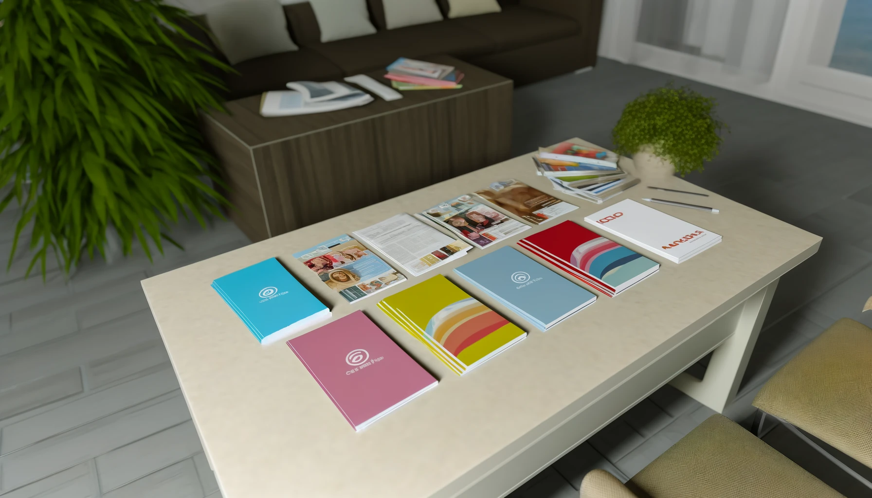
Paper Stock and Finish Options for Trade Show Brochures
The paper you choose for your trade show brochure communicates brand quality before a word is read. Here’s how the main options compare for NYC trade show environments:
★ Most Popular for Trade Show Brochures
The most frequently ordered paper for trade show brochures at Unique Print NY. The gloss coating produces vivid, sharp color reproduction — especially important for product photography, brand colors, and imagery-driven designs. It feels solid and professional without being heavy or adding significant shipping weight for out-of-town exhibitors. The slight sheen catches light and draws the eye in a way that matte stock doesn’t, making gloss brochures more visually arresting on a crowded table.
Best for: Photography-led · Colorful brands · Consumer shows
~148 GSM
Editorial & Sophisticated
A non-reflective coated stock with a calm, refined surface quality. Matte brochures feel more considered and less commercial than gloss — they communicate a certain editorial sophistication that works particularly well for B2B service businesses, professional services firms, luxury brands, and design-led companies. The non-reflective surface is also easier to read under the harsh fluorescent lighting common in many convention center environments. Can be written on, which makes it useful for brochures that double as reference sheets or note-takers.
Writeable surface — practical for reference materials
Budget-Conscious High Volume
A lighter-weight gloss stock that still delivers excellent color reproduction but at a lower cost per unit. The weight difference between 80 lb. and 100 lb. text is noticeable when you hold the two side by side — 80 lb. feels slightly thinner and lighter — but for high-volume general distribution at a busy consumer trade show, the cost saving per unit can be significant without a meaningful drop in visual quality.
Best for: Consumer shows · High-traffic events · Mass distribution
For saddle-stitched booklets, the most cost-effective premium upgrade is to use a heavier cover stock (100 lb. cover) with a soft-touch laminate finish while keeping the interior pages on standard 80 lb. gloss text. The cover is the first thing a prospect touches — investing there delivers the maximum brand impression for the minimum additional cost.
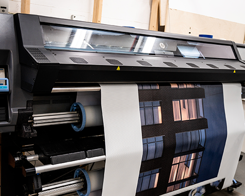
File Preparation: Submitting Print-Ready Brochure Files
Correctly prepared files are the single most important thing you can do to ensure your brochures print on time and exactly as designed. Here are the technical requirements for all brochure files submitted to Unique Print NY:
- Set Document to the Correct Flat Size — Before Folding
A standard tri-fold brochure prints on a flat sheet of 8.5″ × 11″ before folding. Set your document to this flat size — not the folded panel size. In InDesign, create a single 8.5″ × 11″ page and divide it into three equal columns to represent the three panels. For a bi-fold, the flat size is typically 11″ × 8.5″ (landscape). Confirm the exact flat size with Unique Print NY before starting your layout. - Set Color Mode to CMYK — Not RGB
All brochure files must be in CMYK color mode. Designing in RGB and converting at export causes color shifts — particularly in blues, purples, and highly saturated colors. Set your document to CMYK before placing a single element. - Ensure All Images Are 300 DPI at Final Print Size
Check every image’s effective DPI in InDesign’s Links panel before exporting. Any image below 300 DPI at its placed size will print soft and unprofessional. Web-sourced images at 72 DPI are not acceptable for commercial brochure printing. - Add 0.125″ Bleed on All Sides
Any background color, image, or graphic element that reaches the edge of the flat sheet must extend 0.125″ beyond the trim line as bleed. Without bleed, trimming creates white borders along full-bleed elements. - Keep Critical Content 0.25″ Inside the Trim Line
Text, logos, and key imagery must stay at least 0.25″ inside the trim edge to avoid being clipped. For folded brochures, also keep content at least 0.125″ away from fold lines to prevent text from disappearing into the fold. - Embed All Fonts in the Exported PDF
Export using the PDF/X-1a or PDF/X-4 preset in InDesign to ensure all fonts are embedded automatically. Unembedded fonts are substituted by the printer’s system, changing your typography. - Call Unique Print NY Before Submitting
Call (212) 420-9198 or visit 242 West 36th Street, New York, NY 10018 to confirm the exact flat size, fold direction, and any additional specifications for your chosen format before finalizing your file. Our prepress team reviews every brochure file before production — at no charge.
Quantities, Costs, and Timeline
How Many Brochures to Order
The most common mistake in trade show brochure ordering is underestimating quantity. A brochure that runs out on day one of a two-day show leaves half your potential audience with no physical leave-behind from your booth. Use this guide:
| Show Type | Show Duration | Recommended Quantity | Notes |
|---|---|---|---|
| Small industry conference | 1 day | 150–250 | Targeted audience — quality over quantity |
| Mid-size B2B trade show | 2 days | 250–400 | Standard recommendation for most NYC exhibitors |
| Large consumer trade show | 2–3 days | 500–1,000 | High foot traffic — order significantly more |
| Major Javits Center event | 3–5 days | 750–1,500 | Major events can exhaust supply quickly |
| Premium saddle-stitched booklet | Any duration | 100–300 | Reserve for serious prospects only — higher unit cost |
Ordering Timeline
| When to Submit Files | Turnaround | Surcharge |
|---|---|---|
| 10+ business days before show | Standard — 5–7 business days | No surcharge |
| 5–7 business days before | Standard — confirm availability | No surcharge (call to confirm) |
| 3–4 business days before | Rush production | +25–35% surcharge |
| 1–2 business days before | Emergency rush | +35–50% surcharge |
“The best brochure in the room is the one that gets picked up, read, kept, and acted on — not the one with the most panels or the highest page count. Design for the person who’s been walking a trade show floor for four hours. Make their next step obvious.”
— Unique Print NY Production Team
Frequently Asked Questions
Trade Show Brochure Printing in NYC — Done Right
Unique Print NY produces trade show brochures that convert — tri-folds, bi-folds, saddle-stitched booklets, and specialty formats on premium stock. Free prepress review, transparent pricing, and local pickup near the Javits Center.
242 West 36th Street, New York, NY 10018 · (212) 420-9198 · Mon–Fri 9AM–5PM