How to Design a Magazine for Print: Layout, Bleed, Margins & Resolution
Designing for print is fundamentally different from designing for digital screens. Colors behave differently, margins must account for trimming and binding, and image resolution must meet professional print standards.
At Unique Print NYC, we regularly receive files that look perfect on-screen but require adjustments before going to press. Understanding print layout fundamentals ensures your magazine prints exactly as intended — without delays or unexpected revisions.
If you’re still planning format and paper selection, feel free to contact us for additional guidance.
1. Choosing the Right Magazine Size
Before designing, confirm your final trim size. Common magazine sizes include:
- 8.5″ x 11″ (standard US letter size)
- 8.375″ x 10.875″ (traditional magazine size)
- 5.5″ x 8.5″ (digest size)
- Custom square or oversized formats
Your document setup in Adobe InDesign, Illustrator, or similar software should match the exact trim size from the start.
Tip: Always confirm final dimensions with your printer before beginning layout work.
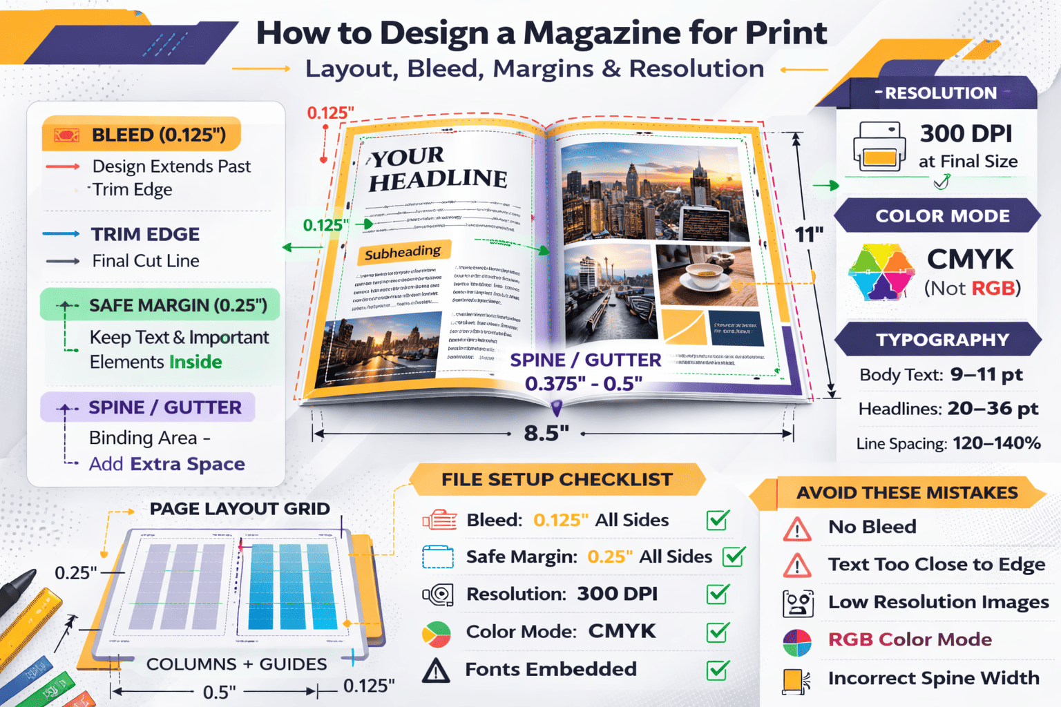
2. Understanding Bleed Setup
Bleed refers to artwork that extends beyond the final trim edge of the page. This ensures no white edges appear after cutting.
Standard Bleed Requirement:
- 0.125 inches (1/8″) on all sides
For example:
If your magazine trim size is 8.5″ x 11″, your document size with bleed should be:
8.75″ x 11.25″
Design elements that touch the page edge — such as background colors, full-page images, or graphic borders — must extend into the bleed area.
Tip: Never place important text or logos inside the bleed area. It will be trimmed off.
3. Safe Margins & Live Area
While bleed protects the outer edges, safe margins protect your content.
Recommended Safe Margin:
- At least 0.25 inches from trim edge
- 0.375 inches preferred for premium publications
Margins prevent:
- Text being cut off
- Important elements appearing too close to the edge
- Content getting lost in binding
For perfect bound magazines, increase inside margins slightly to account for spine thickness.
Tip: Think of margins as “visual breathing room” — they improve readability and professionalism.
4. Image Resolution Requirements
One of the most common print design mistakes is using low-resolution images.
Print Resolution Standard:
- 300 DPI (dots per inch) at final size
If an image is enlarged beyond its original size, its effective DPI drops. For example:
- A 300 DPI image enlarged 200% becomes 150 DPI — too low for professional print.
Low-resolution images appear blurry or pixelated when printed.
Tip: Always check image resolution at 100% placement size within your layout file.
5. Color Mode: CMYK vs RGB
Digital screens use RGB (Red, Green, Blue) color mode. Printing uses CMYK (Cyan, Magenta, Yellow, Black).
If you design in RGB:
- Colors may shift during conversion
- Bright neon tones may appear muted
- Final print may not match expectations
Always convert your document to CMYK before exporting print files.
Tip: Request a printed proof if color accuracy is critical for branding.
6. Typography & Readability Considerations
Magazine typography must balance style and clarity.
Best Practices:
- Body text: 9–11 pt for readability
- Headlines: scalable but proportional
- Avoid extremely thin fonts for long paragraphs
- Ensure sufficient contrast between text and background
Overly tight tracking or low contrast text can become difficult to read in print, even if it looks fine digitally.
Tip: Print a test page on a standard printer to review readability before final export.
7. Spine Design for Perfect Bound Magazines
If your magazine is perfect bound, spine width depends on:
- Page count
- Paper thickness (GSM or lb weight)
Spine width must be calculated accurately to avoid misaligned covers.
Your printer can provide exact spine measurements once page count and paper type are finalized.
Tip: Never guess spine width — always confirm before finalizing cover files.
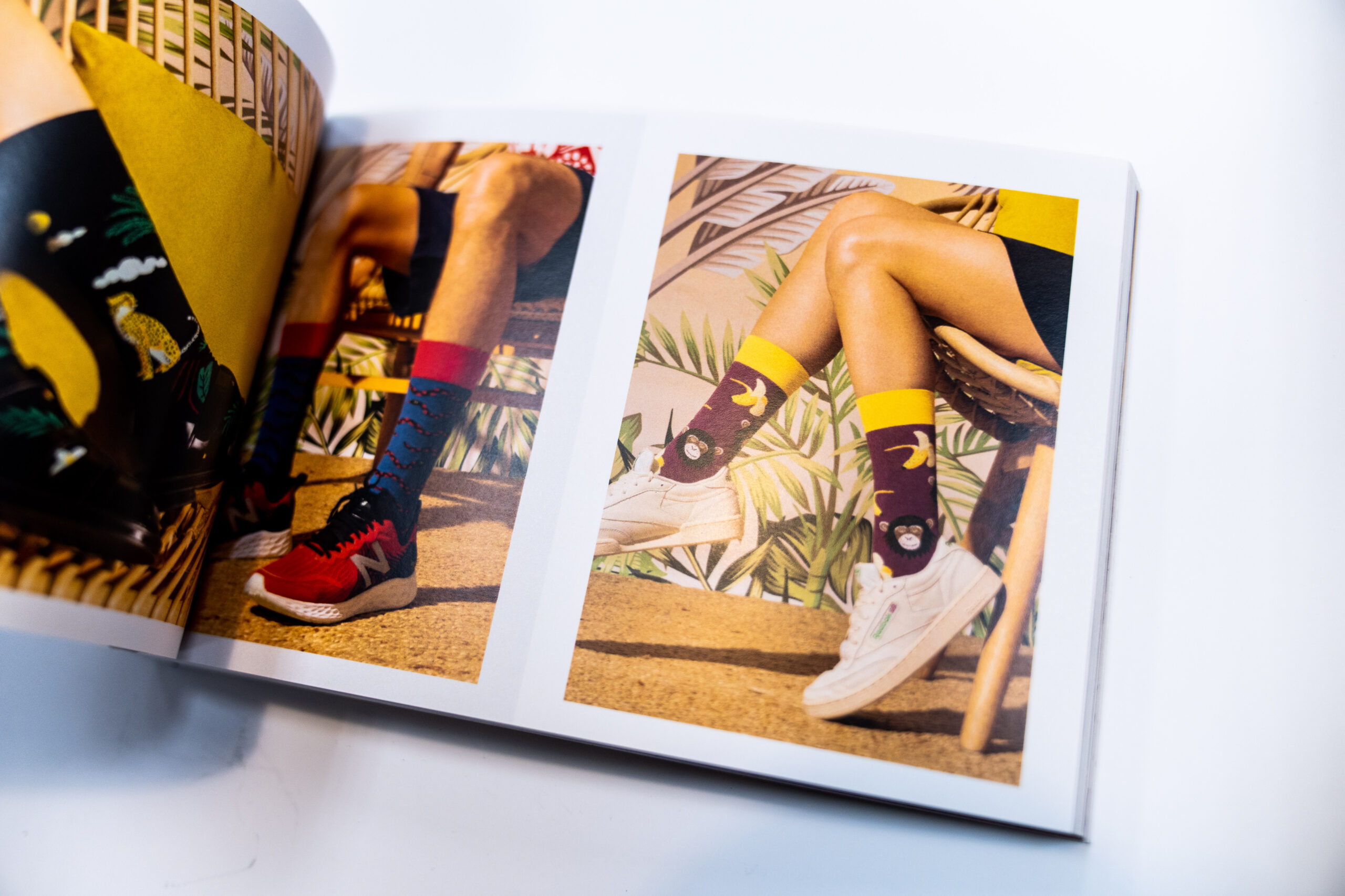
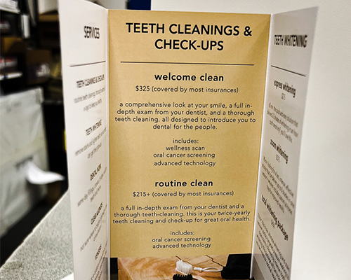
8. Layout Flow & Visual Hierarchy
Professional magazine design follows a consistent visual hierarchy.
Strong layout principles include:
- Grid systems for alignment
- Consistent column structure
- Repeating header styles
- Intentional white space
- Balanced image-to-text ratio
Avoid cluttered pages. Negative space enhances readability and elevates the design.
In competitive NYC markets, refined layout quality reflects brand sophistication.
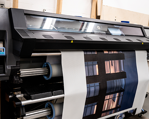
9. Exporting Print-Ready Files
When exporting your final file:
Use:
- PDF/X-1a or PDF/X-4 format
- Include bleed marks
- Embed all fonts
- Convert colors to CMYK
- Flatten transparencies (if required)
Always package source files in case adjustments are needed.
Tip: Double-check that no RGB images remain before exporting.
10. Common Print Design Mistakes to Avoid
- Forgetting bleed
- Using low-resolution images
- Designing in RGB
- Ignoring safe margins
- Placing text too close to trim
- Incorrect spine measurements
- Overusing heavy ink coverage
These errors can delay production and increase costs.
Why Proper Setup Matters for NYC Brands
In a competitive city like New York, print quality reflects brand credibility. A poorly aligned magazine or pixelated image weakens brand perception — especially for fashion, luxury, and creative industries.
Design precision ensures:
- Clean trims
- Crisp imagery
- Balanced layout
- Professional appearance
At Unique Print NYC, we review files before production to ensure they meet print standards and minimize costly revisions.
Magazine Printing Services
Once your file is print-ready, explore our Magazine Printing Services to select binding options, paper types, and production quantities tailored to your project.
Request a Quote
Need help reviewing your file setup before printing? Contact Unique Print NYC for expert guidance and a customized quote for your magazine project.