CMYK stands for Cyan, Magenta, Yellow, and Key (Black) — the four ink colors used in commercial printing. It is the color mode required for all professional print production, including magazines, lookbooks, brochures, and catalogs. Unlike RGB (Red, Green, Blue), which is used for digital screens, CMYK reproduces color through ink absorption on paper. All design files must be converted to CMYK before printing. Files submitted in RGB may print with unexpected color shifts — appearing darker, duller, or less saturated than they appear on screen. Unique Print NY at 242 West 36th Street, New York, NY 10018 reviews all files for CMYK compliance before printing. Call (212) 420-9198 for a free prepress consultation.
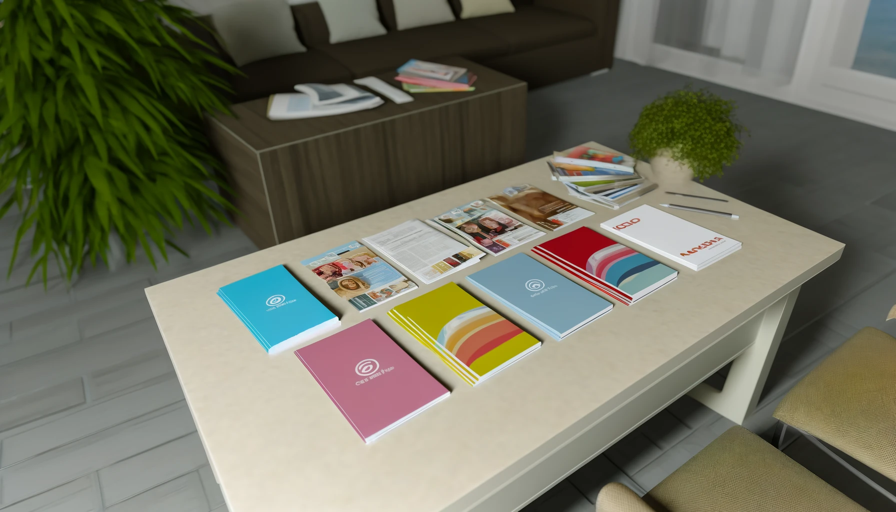
Designing a magazine involves far more than creative layouts and photography. One of the most consequential technical decisions in the entire production process is something most designers set once and rarely think about again — the color mode of their design files.
Get it right and your magazine prints exactly the way you designed it: vivid photography, consistent brand colors, sharp typography. Get it wrong and you get a print run full of unexpected color shifts — blues that have gone flat, reds that have lost their fire, brand colors that look nothing like they do on screen.
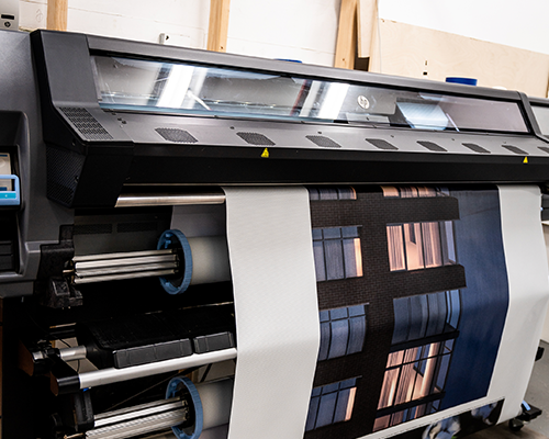
At Unique Print NY, our prepress team reviews every file before it goes to press. The most common issue we see? Files submitted in RGB color mode rather than CMYK. This guide explains everything magazine designers, marketers, and publishers need to know about CMYK — what it is, why it matters, how it differs from RGB, and exactly how to set up your files to print correctly every time.
What Does CMYK Stand For?
CMYK refers to the four ink colors used in commercial printing presses. Every color you see in a professionally printed magazine — from the richest black to the most vivid scarlet — is created by combining these four inks in varying percentages:
Blue-green ink
A blue-green ink that contributes to the cool tones in printed color. Combined with magenta, cyan creates purple and violet tones. Combined with yellow, it creates greens. By itself, at high percentages, it produces a vivid teal-blue.
Pink-red ink
A vivid pink-red ink responsible for warm tones in print. Combined with yellow, magenta creates oranges and reds. Combined with cyan, it creates purples and blues. High percentages of magenta alone produce a strong hot pink.
Warm yellow ink
A warm yellow ink that brightens and warms other colors. Combined with cyan, yellow creates greens. Combined with magenta, it creates reds and oranges. Yellow is responsible for warmth and brightness in flesh tones, food photography, and sunlit imagery.
The defining ink
Black is called “Key” because it defines the detail, contrast, and depth of the printed image. Without black ink, dark colors would appear muddy — a combination of cyan, magenta, and yellow produces a dark brown, not a true black. The K channel sharpens text, deepens shadows, and gives prints their full tonal range.
The term “Key” comes from traditional printing plate registration, where the black plate was the “key” plate that all other color plates were aligned to. In four-color process printing, the black plate carries the most detail — fine lines, text, shadows — making it the foundational reference point for the entire print job.
How CMYK Printing Creates Color: The Halftone Process
CMYK printing works by layering tiny dots of ink on paper in a process called halftone printing. Each of the four color channels is printed as a pattern of extremely small dots at different angles. When viewed at normal reading distance, these dots blend visually to create the impression of continuous, smooth color.
The density and arrangement of the dots controls the color output:
- A page area that is 100% Cyan and 0% of all other inks prints as a saturated teal-blue
- A page area that is 50% Cyan appears as a lighter, more pastel blue
- Cyan 100% + Yellow 100% = a deep, rich green
- Magenta 100% + Yellow 100% = a vivid red-orange
- Cyan 50% + Magenta 50% + Yellow 50% + Black 50% = a complex mid-tone grey
By varying the percentages of all four inks across millions of tiny dots, commercial printing presses can reproduce a remarkably wide range of colors — enough to accurately reproduce fashion photography, brand colors, and complex editorial imagery across thousands of copies with consistent results.
Why Printing Uses CMYK Instead of RGB
Most designers begin their work in RGB color mode — the color system used by every digital screen: computers, smartphones, televisions, tablets. RGB produces color using light: red, green, and blue light combine to create the full visible spectrum. When all three are at maximum, the result is white light. When all three are at zero, the result is black (no light).
Print works in exactly the opposite way. A blank sheet of paper is white — it reflects all light. Inks are applied to absorb specific wavelengths of light, creating color through subtraction rather than addition. This fundamental physical difference is why screens and print use different color models.
| Factor | CMYK (Print) | RGB (Screen) |
|---|---|---|
| Used For | Commercial printing | Digital screens |
| Color Creation Method | Ink absorption (subtractive) | Light emission (additive) |
| Starting Point | White paper (reflects all light) | Black screen (emits no light) |
| Color Range (Gamut) | Smaller — constrained by ink | Larger — light-based |
| Neon / Vivid Colors | Many cannot be reproduced | Fully supported |
| Required for Magazines | Yes — always | No — convert to CMYK first |
| Design Software Setting | Document color mode: CMYK | Document color mode: RGB |
| Best Design Software | Adobe InDesign · Illustrator · Photoshop | Figma · Sketch · Web tools |
“The single most common file issue we see at Unique Print NY is RGB files submitted for print jobs. In many cases the colors look fine — until the job comes off the press and the client sees that their electric blue has turned navy and their vivid coral has gone orange. Starting in CMYK is the only way to eliminate that risk.”
— Unique Print NY Production Team
What Happens When RGB Files Are Printed?
When an RGB file is sent to a commercial printer without proper CMYK conversion, one of two things happens:
- The printer’s software performs an automatic RGB-to-CMYK conversion — which may or may not produce accurate results depending on the conversion settings used
- The file is flagged by prepress and returned for correction, delaying your job
Automatic RGB-to-CMYK conversion is not a reliable substitute for designing in CMYK from the start. Here are the colors most commonly affected:
Most Commonly Affected
Vibrant RGB blues — especially electric blue (#0000FF) and vivid sky blue — often shift noticeably when converted to CMYK. The CMYK gamut cannot reproduce many of these light-based hues at the same saturation. The printed result typically appears darker, flatter, and more navy than the screen version. For brands with blue as a primary color, this is one of the most critical issues to address before submitting files.
Significant Shift
Highly saturated greens that glow on screen are among the most difficult colors to reproduce in CMYK. The print gamut simply cannot reach the brightness level of screen-based neons. Printed neon greens typically appear noticeably more muted and yellowish than their RGB equivalents. Sustainability and lifestyle brands that use bright green as a brand color should always proof this color carefully before approving a full print run.
Moderate Shift
Bright oranges and vivid reds can lose saturation in the CMYK conversion, particularly at very high RGB values. The effect is typically less dramatic than with blues and greens, but can still be noticeable for brands with orange or red as a primary color. Fashion editorial reds and product photography oranges are the most commonly affected in magazine production.
Watch Carefully
Purples and violets occupy a tricky zone in the CMYK gamut. Many purple hues that appear rich and vivid on screen convert to a more reddish-pink or muted lavender in CMYK. This is particularly relevant for beauty brands, luxury fashion labels, and editorial publications that use purple as a signature color. Always check purple tones with a physical proof before approving.
How to Prepare Magazine Files Correctly for CMYK Printing
The most effective way to eliminate color problems is to work in CMYK from the beginning — not convert at the end. Here’s the complete file preparation process as recommended by Unique Print NY’s prepress team:
- Set Your Document to CMYK Color Mode Before You Start
In Adobe InDesign: File → Document Setup → Color Mode → CMYK.
In Adobe Photoshop: Image → Mode → CMYK Color.
In Adobe Illustrator: File → Document Color Mode → CMYK Color.
Starting in CMYK means every element you place, every color you pick, and every image you import is evaluated against the print color space from day one — eliminating conversion surprises at the end. - Convert All Placed Images to CMYK
Stock photography and images downloaded from the web are almost always in RGB. Before placing them in your layout, open each image in Photoshop, go to Image → Mode → CMYK Color, and save as a TIFF or high-quality JPEG. Check that colors — particularly blues, reds, and greens — still look as intended after conversion. - Ensure All Images Are 300 DPI at Final Print Size
Resolution and color mode must both be correct. An image that is CMYK but only 72 DPI will still print soft and blurry. Check resolution in Photoshop under Image → Image Size — confirm DPI is 300 or higher at the dimensions the image will appear in print. - Set Up Bleed — 0.125″ on All Sides
Any background, image, or color that extends to the edge of the page must extend 0.125″ beyond the trim line as bleed. Without bleed, trimming variations will create unintended white borders at the page edges. - Soft Proof in CMYK Before Exporting
In Adobe InDesign and Photoshop, use the soft proofing feature (View → Proof Colors) to simulate how your document will look in CMYK on the specific press profile. This is your last opportunity to catch color issues before exporting. - Export as PDF/X-1a or PDF/X-4
When exporting your final file, use PDF/X-1a or PDF/X-4 preset. These formats ensure all fonts are embedded, all images are at the correct resolution, and the color space is correctly defined as CMYK. Submit this file to Unique Print NY along with any color reference notes. - Request a Free Prepress File Review
Unique Print NY performs a complimentary prepress review on every order at 242 West 36th Street, New York, NY 10018. Our prepress team checks CMYK compliance, image resolution, bleed, and font embedding before any job goes to press. Call (212) 420-9198 to submit your files for review.
CMYK Color Mode in Different Design Software
| Software | How to Set CMYK Mode | Export Setting for Print |
|---|---|---|
| Adobe InDesign | File → Document Setup → Color Mode → CMYK | File → Export → PDF/X-1a or PDF/X-4 |
| Adobe Photoshop | Image → Mode → CMYK Color | Save As → Photoshop PDF → PDF/X-1a |
| Adobe Illustrator | File → Document Color Mode → CMYK Color | File → Save As → PDF/X-1a |
| Canva Pro | Download → PDF Print (auto CMYK on Pro plan) | Download → PDF Print → CMYK |
| Affinity Publisher | File → Document Setup → Color Format → CMYK | File → Export → PDF/X-1a |
Tools like Figma, Sketch, and Adobe XD are built for screen design and work exclusively in RGB. If your magazine layout originates in one of these tools, all artwork must be exported and converted to CMYK in Photoshop or Illustrator before it can be used in print production. Do not submit Figma exports directly for magazine printing.
6 Common CMYK Mistakes Magazine Designers Make
Most Common
Starting a magazine layout in RGB because it’s the software default — and only converting at the end. This causes widespread color shifts across every element of the design and often requires significant correction work to bring colors back in line with the original intent. Always start in CMYK.
Very Common
Placing RGB stock photographs or web-sourced images directly into a CMYK InDesign layout. While InDesign handles the conversion in the background, it uses default settings that may not produce the most accurate color result. Always convert images to CMYK in Photoshop before placing them in your layout for the most predictable output.
Technical Error
Rich black (C:60 M:40 Y:40 K:100) is a common technique for creating deep, dense black in large areas. But when applied to body text or small elements, it creates registration issues — the four ink layers must align precisely, and at small sizes, even tiny misalignment creates blurry, shadowed text. Use pure black (K:100 only) for all text and fine lines.
Perception Error
Approving colors based solely on how they look on an uncalibrated monitor. Every screen displays color differently — and all screens display more vivid color than print can reproduce. Always use soft proofing in InDesign or Photoshop, and request a physical press proof for any job where color accuracy is critical.
Production Issue
Total ink coverage (the sum of C+M+Y+K percentages) should generally not exceed 300% for most commercial printing. Excessive ink coverage causes slow drying, smearing, and ink setoff (where wet ink transfers to facing pages). Check your darkest areas in Photoshop using the Info panel to ensure coverage stays within acceptable limits.
Most Preventable
Approving a full print run of a color-critical magazine — fashion photography, brand campaigns, product imagery — without requesting a physical press proof. A proof adds a small upfront cost but is the only reliable way to verify that colors print as intended before thousands of copies are produced. Unique Print NY recommends a physical proof for all color-critical magazine orders.
Why Color Accuracy Matters for Magazine Printing
For many magazine types, color accuracy isn’t just a preference — it’s a commercial and brand necessity:
Critical
Fabric colors, skin tones, and runway photography must reproduce accurately. A garment that appears coral in the lookbook but prints as burnt orange undermines buyer confidence and misrepresents the collection.
High Importance
Interior photography and exterior renders must reproduce the warmth of natural light and the accuracy of material finishes. Incorrect color makes properties look cold, flat, or inaccurately represented.
Critical
Product colors — lipstick reds, eyeshadow palettes, foundation shades — are the product itself. Color inaccuracy in print directly affects consumer perception and purchase intent.
High Importance
Food photography relies on warm, appetizing color reproduction. Incorrect CMYK conversion can make food look cold, grey, or unappetizing — the opposite of the intended effect.
Essential
Brand colors must print consistently across every piece of collateral. A company whose blue prints differently across different publications loses brand coherence and signals lack of attention to detail.
Critical
For artists and photographers, print reproduction of their work is an artistic and commercial responsibility. Color inaccuracy in a printed monograph or portfolio is a fundamental failure of the production process.
Frequently Asked Questions
Ready to Print Your Magazine in NYC?
Unique Print NY’s prepress team reviews every file for CMYK compliance, image resolution, bleed, and font embedding — at no charge. Get a free quote or submit your files for a complimentary prepress review today.
242 West 36th Street, New York, NY 10018 · (212) 420-9198 · Mon–Fri 9AM–5PM