Best Business Card Layout by Industry
When it comes to business card design, one size does not fit all. A well-designed business card layout should reflect not only your personal brand but also the expectations and norms of your industry. From sleek and minimal tech cards to elegant and trustworthy designs for finance, aligning your card layout with your field can leave a lasting impression and open more doors.
In this article, we explore the best business card layout ideas tailored to top industries including real estate, finance, tech, law, and creative professions.
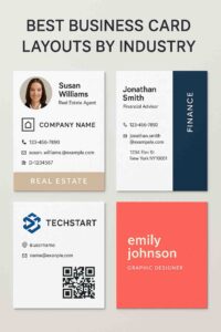
Real Estate: Make It Personal and Trustworthy
Recommended Layout Features:
- Headshot photo: Builds familiarity and trust.
- Company logo + name: prominently displayed.
- Clear contact hierarchy: (phone, email, license #).
- Back of card: with a property photo or QR code linking to listings.
Design Tips:
- Use warm tones and serif fonts to appear approachable.
- Opt for a vertical layout to stand out from traditional horizontal designs.
- Keep plenty of white space to avoid clutter.
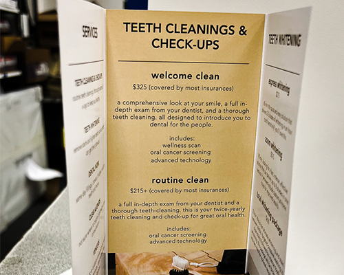
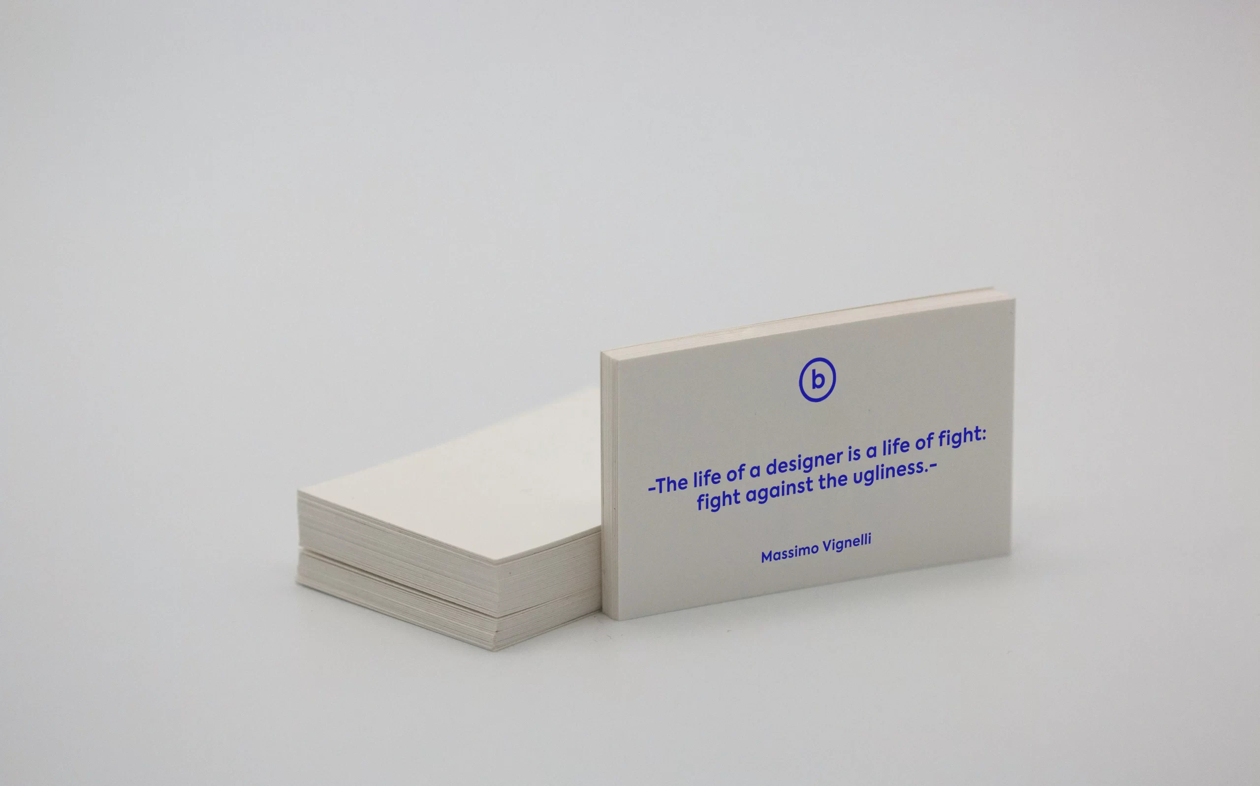
Finance & Accounting: Keep It Clean and Professional
Recommended Layout Features:
- Simple two-column layout: Name/title on the left, contact info on the right.
- Monochrome or two-tone color palette: (navy, black, silver).
- Minimal use of graphics: let the typography speak.
Design Tips:
- Stick to classic fonts like Garamond or Helvetica Neue.
- Use embossing or foil stamping sparingly for a premium feel.
- Avoid busy back sides; consider a quote or tagline instead.
Tech & Startups: Bold, Minimal, and Digital-Ready
Recommended Layout Features:
- Logo-centric front with bold branding.
- Social media handles and LinkedIn.
- Optional QR code linking to a digital resume or landing page.
Design Tips:
- Use geometric layouts and high-contrast color schemes (black/yellow, blue/white).
- Consider square or die-cut shapes to break the mold.
- Fonts like Roboto or Inter give a modern, clean edge.
Law & Legal Services: Traditional and Authoritative
Recommended Layout Features:
- Centered layout with firm name/logo up top.
- Full name + credentials(Esq., JD) beneath.
- Contact details in clean rows below.
Design Tips:
- Use navy, burgundy, or dark green for color schemes.
- Choose engraved print or thermography for classic texture.
- A text-only layout often works best—avoid icons or images.
Creative Industries: Showcase Personality
Recommended Layout Features:
- Full-bleed visuals on one side (artwork, photography, branding).
- Minimal text — name and one primary contact method.
- Use the card to tease your aesthetic or skillset.
Design Tips:
- Try transparent, textured, or recycled stock.
- Use handwritten-style fonts, gradients, or vibrant colors.
- Consider adding a short slogan or creative job title.
Bonus: Universal Layout Tips for Any Industry
Recommended Layout Features:
- Hierarchy mattersMake your name and role the most visible elements.
- Use high-resolution imagesEspecially if using headshots or logos.
- Margins and spacingDon’t overcrowd — let elements breathe.
- Print quality countsCheap materials can hurt your brand.
Final Thoughts
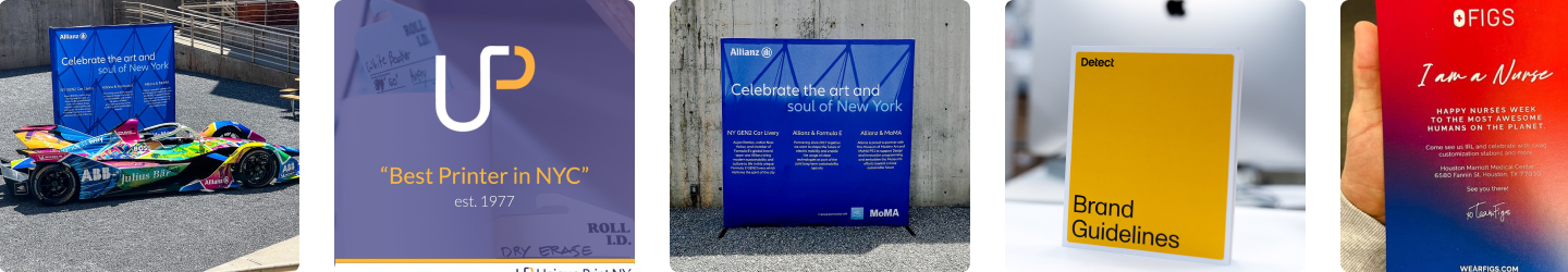
Whether you’re closing deals in Manhattan real estate or pitching your next startup in Brooklyn, the right business card layout can make a powerful first impression. Aligning your design with industry norms while adding a personal touch ensures your card ends up in a wallet—not a waste bin. At Unique Print NY, we offer a wide variety of business card printing options, from premium paper stocks and font layout consulting to finishing touches like foil, lamination, and die-cut shapes. Whether you already have a design or need help choosing the perfect business card layout, we’re here to help.
Check out our buying guide for Business Cards
Visit us in Manhattan, or request a quote today for fast turnaround and expert support.